Editor’s Note: This is “Part 1” of a 3-part series on factors that contribute to effective ecommerce design.
Humans tend to be visually oriented. Everything from the car we drive, the clothes we wear, and the smartphones we carry tend to be largely based on what visually appeals to us. We can look at something and instantly decide whether or not we like it.
Deciding whether to make a purchase on someone’s ecommerce site is no different. While a nicely designed site is only one component in a successful ecommerce strategy, it’s an important one. A well-designed site looks more professional and eases some of the concerns of doing business there.
Good vs. Elaborate
Understand that good design doesn’t necessarily mean elaborate design. That’s where a lot of people get confused. I’ve read more than my share of articles stating, “I’ve sold more with this simple design than I did with a professional one.” I find the majority of those articles disingenuous because either the original designer made mistakes that didn’t follow the best practices or the authors have learned how to improve the site’s search engine optimization after reverting to a template or minimal design. If these lessons had been applied initially, the original designs would have converted well, too. But I’ll leave that for a future article.
This article will focus on the steps to take once you’ve hired a company to design your site. The key to a successful relationship is to plan ahead and have a basic idea of what you want before approaching any designer. The more you know and understand, the less you’ll leave up to the interpretation of those building your website and the better the experience will be for all parties involved.
Review Other Ecommerce Sites
Most online stores operate in a similar fashion and contain many of the same elements. There’s a reason for this: best practices. SearchSoftwareQuality, a website that addresses software matters, puts it this way: “A best practice is a technique or methodology that, through experience and research, has proven to reliably lead to a desired result. A commitment to using the best practices in any field is a commitment to using all the knowledge and technology at one’s disposal to ensure success.”
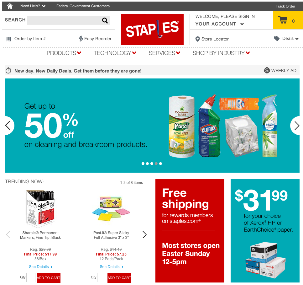
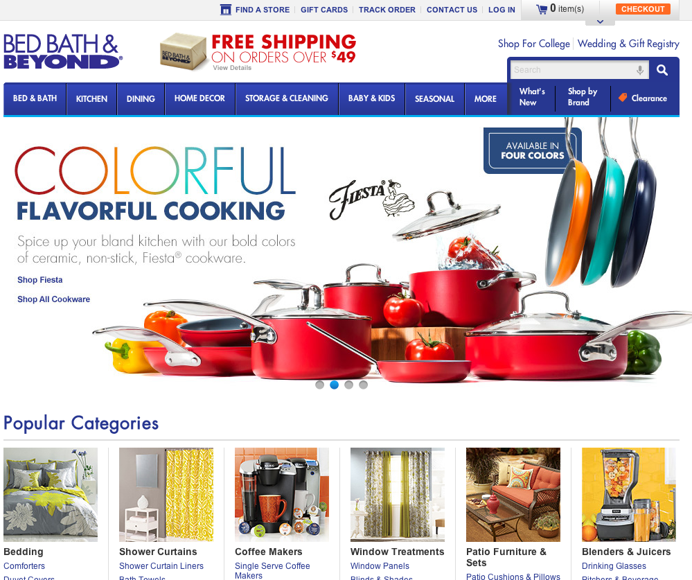
Thus, the reason why so many online stores operate in an almost identical fashion is because they follow a procedure that has produced optimal results. Take, for example, the two sites below: BedBathandBeyond.com and Staples.com. Although the categories may vary and the design of each site is vastly different, these two stores — and many others — tend to operate in a similar fashion. Note the horizontal logos, rotating banners at top, and featured items below the banners.

Staples
Using a proven design that generally produces results is very important. I’ve received requests from clients that are so bizarre that I ponder whether or not they’ve actually ever visited any ecommerce sites. For instance, one woman didn’t want a header on the product pages; she only wanted it on the home page even after we — me, account reps, other staff — explained that this is a necessity for numerous reasons.
I now work for Solid Cactus, a leading ecommerce design firm. Before that, when I freelanced, I would compare myself to a mechanic. You can tell a mechanic that you don’t like where the brakes are on your car and that you want them moved to the back seat of the passenger side. But it’s the mechanic’s job to explain to you why that is not a good idea and simply not do it. As a freelancer, I had the option of turning down a project that I felt wasn’t a good match for me. As a professionally employed designer, however, that luxury went away. Ultimately, it’s a business. If my company doesn’t do it, another company will. Of course, when the site’s sales don’t live up to expectations, guess who gets the blame for the flawed design?
Logos
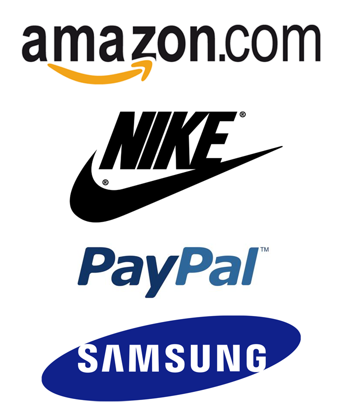
Your logo is crucial as it’s the cornerstone of your brand. It can either enhance your company’s profile or ruin it. Everyone, seemingly, with a design program thinks he can design a logo. I’m horrible at designing logos. Whenever I’m asked to do one, I usually refer that person to a friend who’s really good at creating them. This brings up an important point. No one is good at everything. If you’re having a logo designed, make sure it’s by someone with experience in designing logos.
Here are a few rules to follow for a new logo.
- Horizontal logos work better on websites than vertical logos.
- Try not to utilize more than two colors and avoid gradients whenever possible.
- That great photo of your father who started the company should not be included in your logo. As a matter of fact, no photos should be used.
- Try to keep the number of fonts used in the design to two.
- Make sure your logo will work in black and white as well as color.
- The best logos are simple. You don’t need a ton of details.
- Whoever creates your logo should provide a true vector version (i.e., .eps, .svg, .ai), which is scalable and renders well at any size. Too many times, I’ve seen logos created in a pixel-based program, which causes problems when a logo needs to be scaled to fit onto a promotional pen or enlarged to be draped across a banner.

Logos don’t have to be elaborate. The best logos are simple, versatile, and memorable.
There are exceptions to every rule. But, if your logo designer follows the rules set forth above, you’ll run into a lot less difficulty down the line.
See “Understanding Ecommerce Design, Part 2: Banners and Boxes.”


