
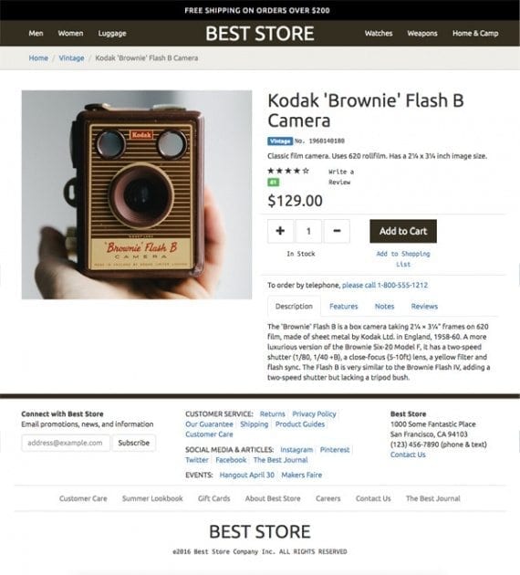
Bootstrap makes it possible to quickly lay out web pages, creating templates that can be used with many ecommerce platforms.
The footer or bottom section of an ecommerce web page is often where shoppers look to find privacy policies, return information, or even a way to contact the store owner or manager. A well-planned and organized footer can help your shoppers.
Bootstrap makes laying out an attractive and functional ecommerce footer easy. The Bootstrap framework uses HTML, CSS, and sometimes JavaScript to provide a set of classes that will make your page look good without a significant amount of custom style sheet development.
Bootstrap can be used with many ecommerce platforms, including themes for Shopify, Volusion, WooCommerce, and LemonStand, as examples.
This article is the third installment in my series on using Bootstrap. I’ve addressed how to lay out responsive product detail pages and how to design a page header that is both fixed in position and responsive for mobile devices. Both of these articles relied on Bootstrap and serve as a foundation for this article on the page footer.
To use Bootstrap, you will need to add it to your project. Here, for example, is a link to include in the head section of your page.
<link
 href="https://maxcdn.bootstrapcdn.com/bootstrap/3.3.6/css/bootstrap.min.css"
 rel="stylesheet"
 integrity="sha384-1q8mTJOASx8j1Au+a5WDVnPi2lkFfwwEAa8hDDdjZlpLegxhjVME1fgjWPGmkzs7"
 crossorigin="anonymous"
>
Content for the Page Footer
There are many opinions about what sort of content belongs in a web page’s footer section. A more exhaustive discussion of the topic could fill up another article or two. Nonetheless, for the sake of describing how you might use Bootstrap to lay out an ecommerce page footer, I’ll include five content sections, which are:
- An email subscription form;
- A section for links;
- The store’s address and phone number;
- A footer navbar for featured footer links;
- A brand and copyright section.
Footer Structure
The page footer will rely on Bootstrap’s responsive, mobile-first grid system. This grid allows you to lay out page elements without creating a lot of CSS. The grid items will flow up to 12 columns as the size of the device increases.
The Bootstrap grid has a specific structure. In the code below, I’ll use the semantic HTML5 footer tag to designate the entire footer section. Inside of this footer element, I include a div with a container class. This container class is the first level, if you will, in the Bootstrap grid system.
<footer class="navbar-default">
 <div class="container">
 ...
 </div><!-- end container -->
</footer>
Inside of the container, we add a row, which is the next level in the Bootstrap grid.
<footer class="navbar-default">
 <div class="container">
  <div class=”row bottom-rule”>
   …
  </div>
 </div><!-- end container -->
</footer>
The bottom-rule class references a custom CSS declaration that adds a light gray border to the bottom of the element. Bootstrap provides a lot of classes to work with, and it does not interfere with our ability to use custom CSS as we see fit.
.bottom-rule {
    border-bottom: 1px solid lightgray;
}
Inside of this row, I will place additional div elements, each taking up a specified number of columns in the Bootstrap grid.
I can also give the footer a top border to help separate it from the rest of the page content.
footer {
    padding-top: 20px;
    border-top: 10px solid #332e20;
    background-color: white;
}
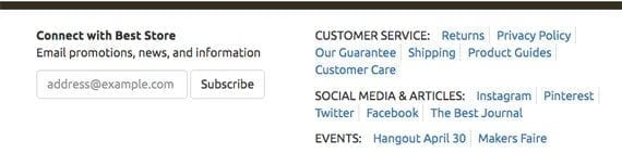
Email Subscription Form
The first section in the footer will be an email subscription form. It will take up to four columns in the small Bootstrap grid. The grid size and number of columns is contained in a single Bootstrap class, col-sm-4.
<div class="col-sm-4 footer-section">
    ...
</div>
The footer-section class is a custom declaration that adds a bottom border and some additional padding.
.footer-section {
    margin-bottom: 20px;
    padding-bottom: 20px;
    border-bottom: 1px solid lightgray;
 }
When the footer is shown on a mobile device, we want a clear separation between the email subscription form and what follows below it. This is because on mobile devices with relatively small screens the columns will stack on top of each other. So the email form will be above the next section, which includes links.
Bootstrap is mobile-first and responsive. When the screen width is smaller than the specified grid, Bootstrap will stack elements with a column class. So on a mobile device the form is stacked on top of the next section. The bottom border helps to define the different sections.
However, we do not want the bottom rule or extra spacing to appear on devices with screens larger than 768 pixel across. On these screens, the sections in this row will line up horizontally, thus the email form will be next to the link section.
In the example, when the footer is displayed on a screen 768 pixels or wider, the email form section and link section are next to each other.
To manage this, we use a CSS media query.
@media (min-width: 768px) {
   ...
}
The CSS declarations inside of the media query will only be applied on devices with screens at least 768 pixels wide. Notice that now the footer-section class does not add space or a border.
@media (min-width: 768px) {
    .footer-section {
        margin-bottom: 0;
        padding-bottom: 0;
        border-bottom: none;
     }
 }
Now, that we’ve taken care of how the section lays out on different size devices, let’s get the “Connect” content in place. We can use a simple strong tag to emphasis that section. And an equally simple p tag (a paragraph) houses the section description.
<div class="col-sm-4 footer-section">
    <strong>Connect with Best Store</strong>
    <p>Email promotions, news, and information</p>
    <form class="form-inline">
        <div class="form-group">
            <label
                class="sr-only"
                for="inputEmail"
            >Email</label>
            <input
                type="email"
                class="form-control"
                id="inputEmail"
                placeholder="address@example.com"
            >
         </div>
         <button type="submit" class="btn btn-default">Subscribe</button>
     </form>
 </div>
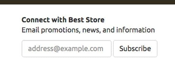
The Bootstrap form-inline class specifies a form’s general appearance and lays it out horizontally.
The form-inline, form-group, and form-control classes come from Bootstrap. These classes will lay out the basic email subscription form. There is no further CSS work to do. It is just that simple.
Three other classes to note are: sr-only, which only shows the associated element to a screen reader; btn, which lays out the subscription button; and btn-default, which applies background, border, and fonts colors to the button. Again, these are standard with Bootstrap, so we only need to have included Bootstrap in our project and referenced the classes here.
This is a layout, not a fully functional page. So for the moment we’re done. If you were integrating this with an ecommerce platform, you would need some code to capture the email address and add it to your list.
Section for Links
Working in the same Bootstrap row as our email form, let’s add a section for links. This section will occupy five columns in the small Bootstrap grid.
<div class="col-sm-5 footer-section">
<ul class="list-inline">
<li class="text-uppercase">Customer Service:</li>
<li><a href="#">Returns</a></li>
<li><a href="#">Privacy Policy</a></li>
<li><a href="#">Our Guarantee</a></li>
<li><a href="#">Shipping</a></li>
<li><a href="#">Product Guides</a></li>
<li><a href="#">Customer Care</a></li>
</ul>
<ul class="list-inline">
<li class="text-uppercase">Social Media & Articles:</li>
<li><a href="#">Instagram</a></li>
<li><a href="#">Pinterest</a></li>
<li><a href="#">Twitter</a></li>
<li><a href="#">Facebook</a></li>
<li><a href="#">The Best Journal</a></li>
</ul>
<ul class="list-inline">
<li class="text-uppercase">Events:</li>
<li><a href="#">Hangout April 30</a></li>
<li><a href="#">Makers Faire</a></li>
</ul>
</div>
Notice that the section is made up of three unordered lists (ul). We use the Bootstrap class list-inline to specify that we want these lists to lay out horizontally. Bootstrap takes care of the rest.
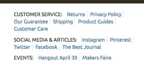
Three unordered lists constitute the link section.
We can customize this Bootstrap class a bit, too. The CSS declaration below puts a light gray border on the right side of each list item, excluding the first and last item in each list.
footer .list-inline li:not(:first-child):not(:last-child) {
    border-right: 1px solid lightgray;
}
Show the Store Address and Phone Number
The third section in this footer row shows the store’s basic content information.
<div class="col-sm-3">
<address>
<strong>Best Store</strong><br>
1000 Some Fantastic Place<br>
San Francisco, CA 94103<br>
(123) 456-7890 (phone & text)<br>
<a href="#">Contact Us</a>
</address>
</div>
Bootstrap has styles for that layout and address, so the code above is all that we needed.
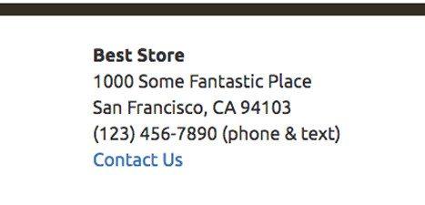
Adding an attractively styled address to the footer requires nothing more than the basic HTML.
Navbar for Your Footer
Inside of a new Bootstrap row, I will add a navbar to the footer. This navbar will feature several additional links.
<div class="row bottom-rule">
    <div class="col-sm-12">
        <nav class="navbar navbar-default navbar-footer">
            <ul class="nav navbar-nav">
                <li><a href="#">Customer Care</a></li>
                <li><a href="#">Summer Lookbook</a></li>
                <li><a href="#">Gift Cards</a></li>
                <li><a href="#">About Best Store</a></li>
                <li><a href="#">Careers</a></li>
                <li><a href="#">Contact Us</a></li>
                <li><a href="#">The Best Journal</a></li>
            </ul>
        </nav>
    </div>
</div><!-- end row -->
This code, above, is a good example of what Bootstrap can do for your pages. There’s basic HTML that is seasoned, if you will, with a number of classes.
- row – Sets up a row in the Bootstrap grid.
- bottom-rule – A custom (not Bootstrap) declaration for adding a bottom border.
- col-sm-12 – Defines how many columns this section will occupy on the Bootstrap grid.
- navbar, navbar-default, nav, and navbar-nav – Bootstrap classes that describe how a navbar ought to look and how it should be positioned.
- navbar-footer – Another custom (not Bootstrap) CSS declaration, and the only new class for us to look at.
First, the navbar-footer class helps modify the way a Bootstrap navbar looks by using a target, to which we can assign our own CSS declarations.
.navbar-footer {
    background-color: inherit;
    border-radius: 0;
    border: none;
}
When the navbar is displayed on a screen 768 pixels or wider, we want the links to be centered. This is not standard for a Bootstrap navbar, so we need to make a couple of CSS declarations.
.navbar-footer {
    margin-bottom: 0;
    text-align: center;
}
footer .navbar .navbar-nav {
    display: inline-block;
    float: none;
    vertical-align: top;
}
Notice that the first of these references the navbar-footer class, while the second address the navbar-nav class. Effectively, these classes remove a float, change how the links are displayed, and center the links.
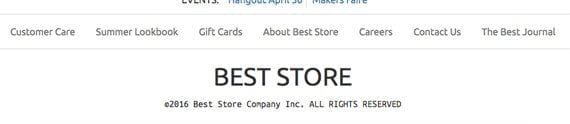
The navbar shows featured footer links.
A Place for the Copyright
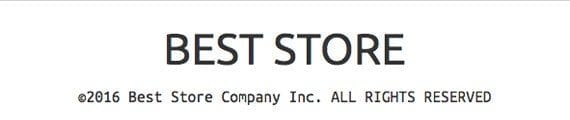
The final section in the footer includes the copyright information — another chance to show off the store’s brand.
The final section in the footer is also a new Bootstrap row.
<div class="row leg-room">
<div class="col-md-12 text-center">
<h1 class="text-uppercase">Best Store</h1>
<p class="monospaced">
©2016 Best Store Company Inc.
<span class="text-uppercase">All Rights Reserved</span></p>
</div>
</div><!-- end row -->
In this section there are a few unfamiliar classes. The first of these is leg-room. This custom class adds margin and padding to the bottom of the section.
.leg-room { margin-bottom: 20px; padding-bottom: 20px; }
The text-center class comes from Bootstrap. It does exactly what its name implies. The text-uppercase class is also from Bootstrap.
The monospaced class is custom. It sets the font family for the affected text.
.monospaced { font-family: 'Ubuntu Mono', monospaced ; }
This will only work if the Ubuntu Mono font is available. So let’s include it in the document head.
<link href='https://fonts.googleapis.com/css?family=Ubuntu+Mono' rel='stylesheet' type='text/css'>
Summing Up
This article demonstrates one way to use Bootstrap to lay out the footer on an ecommerce web page.
The footer relies on Bootstrap grid system and just a few custom CSS declarations.


 SEO Wins from Reddit Pro
 Mixed Reports on AI Ecommerce Traffic
 Google Patent Signals New Search Layer
 New Ecommerce Tools: April 8, 2026
 New Ecommerce Tools: April 15, 2026
 AI Creative Tools in Google Ads
 SEO for AI, Low Traffic, No Clicks