Practical eCommerce is a website with the purpose of providing down-to-earth advice to help smaller businesses succeed online. Advice comes in the form of easy to follow articles, podcasts and regular newsletters as well as blogs that allow readers to communicate with each other.
The business goals of Practical eCommerce are to create valuable content for a small business/ecommerce audience so that targeted advertising can be sold. Practical eCommerce also provides a supplier directory, with free and premium paid options, and a job board for companies to post ecommerce related jobs.
 In the first of this new Quick Review series – Practical eCommerce Publisher Kerry Murdock has put his own site up for review – let’s see how it does.
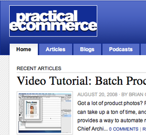
Home page
The home page is usually the first page that people view when the visit a website. For new visitors, it’s important to provide a clear overview of the purpose of the website, and provide quick pathways to information they may be seeking.
Missing a strapline. A very simple, but beneficial change for Practical eCommerce would be to include a clear and concise strapline to go with the logo presented at the top left of the page. Something along the lines of “down-to-earth advice for small online businesses” would be suitable, or alternatively use of its title tag “resources for online business owners.”
Promote popular content. When thinking about website visitors we like to think in terms of different customer behaviors. Some of these include “trackers,” “hunters,” and “explorers.”
Trackers are people who know exactly what they want. In the case of Practical eCommerce, it is most likely a specific article that they are aware of. Trackers are well catered for on Practical eCommerce with a site search functionality prominently displayed on every page.
Hunters are people who only have general ideas of what they are looking for, for example information on ecommerce usability. They are also well catered for with featured tags that provide a quick jump into specific areas of content.
Explorers are people with less well-defined goals, and require inspiration, suggestions and recommendations. Again, explorers are reasonably well catered for with a panel that shows “most active” content. However, it is placed quite far down the page and perhaps could be given greater prominence.
Navigation pages
In an abstract sense, many websites follow a common pattern of a home page, target content pages that people are trying to reach, and in between these are navigation pages that help people find the specific content they are seeking.
Excluding search, Practical eCommerce offers two main methods of finding content. The first is by navigating by content medium (article, blog or podcast) and then choosing a topic within that area. The second is choosing a tag and being able to view resources that match that tag.
When visitors choose to follow a path based on medium (for example, to click on the articles tab) they are presented with a list of recent articles and the option to narrow these down by a subtopic of articles. This presentation is essentially the same as the home page and adds little value to visitors. There would probably be more value in providing a clear list of topic areas with specific detail about the content of each area. (For instance, what does “search engine optimization” really mean and what will these articles cover?) This could also be a good opportunity to provide scent trails to relevant content from the blog, podcast and directory sections.
The tag navigation pages are a great concept, for any given subject. For instance, with “search engine optimization” people can see relevant content from all over the site.
However, there’s a small detail here however may have large consequences. Matching content for any tag is broken up into articles, posts, podcasts, directory and jobs. While this is fine, the visual treatment of the tabs to view these results is very low contrast. People may misunderstand these results and believe that they are viewing all content that matches a tag, when in reality they are only viewing articles which is the default option. The contrast between the active tab and the other options should be increased, and a default category of “all content” should be used to increase the visibility of all content on the site rather than focusing on articles.
Content pages
Content pages (such as pages that display an actual article, blog post or podcast) need to clearly showcase the specific content, but once someone has finished absorbing content, the goal is to prevent them from leaving the site, and instead continue engaging with the website in some way. In the case of Practical eCommerce, this might include navigating to read another article, commenting on an article or perhaps signing up for the Practical eCommerce newsletter.
Promote relevant content
At the start of the article page there is some information about the article including the author, category and associated tags. These all act as links to navigation pages that list further content. Their position at the top of the page is not optimal though as people are more likely to be focused on reading the actual content. If this was presented in a more persuasive manner and at the end of the article it could provide a nice continuum into related content and therefore encourage website stickiness. This would also be an excellent point to promote newsletter signup and RSS feeds.
Encourage participation
After reading an article or post, or listening to a podcast episode, it is a goal to encourage people to participate by leaving a comment. Currently, the functionality to leave a comment is presented at the end of all existing comments rather than at the end of the content itself. As with the positioning of the links to navigation pages, this is the right idea but not in the ideal position on the page. This would probably have greater use if it were presented immediately after the post, and also with more a more persuasive call to action (with a focus on “sharing your opinion” instead of “sign in to leave a comment”).
For people who want to comment that are not already members, we found that the current registration form to be a significant barrier. If Practical eCommerce is not willing to allow comments without registration, the sign up process should be streamlined to such an extent that it could occur painlessly during the process of leaving a comment rather than having to leave the page.
Promote newsletter sign up
On content pages there is a panel to promote the Practical eCommerce newsletter, however it takes the form of an advertising banner, which due to “banner blindness” may often be overlooked.
A better approach would be more persuasive text such as “Enjoyed this article? Sign up to our regular newsletter for updates on straight to your inbox.” Ideally this should be next to a text field that allows people to enter their email address and sign up for a newsletter directly on the page.
Create an account
An account is required for users to leave comments on articles and to receive email newsletters. The requirement to create an account can be a significant barrier to many people as they may not perceive the benefits or understand the reasoning. This may limit participation. If Practical eCommerce insists on account registration, then it could perhaps be presented much more persuasively. Currently, the main benefits are hidden in a block of text, which is above the main heading on the page for step 1 – Create Your Account. Because of the way people scan, it is most likely that people miss the “value proposition” text above.
A revised design with much more emphasis on the benefits at the head of the page would lead to increased sign-ups.
Conclusion
The new Practical eCommerce website is a nice clean website and is a good example of a magazine style website for ecommerce business owners. With a few minor upgrades the website could take a few steps forward in meeting its own business goals of increasing participation with the website and ultimately increase the value of advertising dollars.
How does your site measure up?
Request a usability review of your ecommerce site from usability experts. Email conversion@practicalecommerce.com.