
Editor’s Note: In September we published “Volunteer for a Free Mobile-Optimized Ecommerce Site,” soliciting merchants to volunteer for a mobile optimization case study in which we follow the process of creating a mobile site step-by-step. Dozens of merchants submitted their sites, and after a review process, we narrowed our selection to DecalGirl.com. The third installment of the case study follows, below.
The first installment, “Optimizing an Ecommerce Site for Mobile Devices, Part 1: Getting Started,” we published in November, as MobilizeToday.com, a mobile development firm, and DecalGirl.com, an ecommerce company that sells “skins” for mobile devices, began exploring strategies on how to best approach this project.
We published the second installment, “Part 2: Layout and Design,” in early December following the initial mockup of the mobile home page development for DecalGirl.com.
Now, we review their progress to date, as they have worked solidly through November and December.
Inner-Page Design and Development
In “Part 2,” Peters produced his own home page design, contrary to the original mockup that Trugbild designed. Both parties preferred Peters’ own design.

Peters’ home page design.
Now, with the home page’s aesthetic direction and functionality relatively agreed upon, the inner-page design — navigation as well as compatibility with differing mobile devices — were the next stages of development.
Peters wanted to keep the navigation from the home page to the inner-pages as streamlined as possible, utilizing three main buttons: “Shop for Skins,” Browse Designs,” and “Browse Artists.”
Peters’ goal is that a consumer could drill-down with a few concise and intuitive selections. He wants his consumers to start by selecting, for example, “Shop for Skins.” That would take the consumer to a list of device manufacturers where the user could select, say, “Apple” and get a list of device types made by Apple. Then a user could shop for skins for that specific type of device from Apple.
With Peters’ goals in mind, Trugbild offered the following initial inner-page design.
After a user selects an option from the main menu, a list of sub-menu items appears. The list fills the entire frame of the mobile device and is auto-adjusting to landscape or portrait view. Each selection on an inner-page sub-menu focuses the consumer’s search further, as Peters’ wanted. And each page has a streamlined navigation with just category buttons and a set of “Previous/Next” buttons at the bottom of each page.
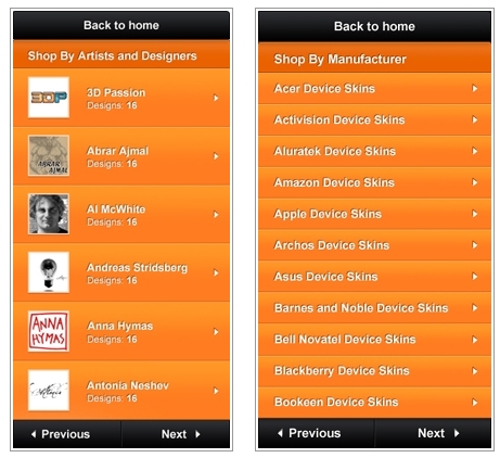
Trugbild’s paginated inner-page mockups.
Aesthetically, Peters felt that the orange color choice was too overwhelming and requested a darker color for the background of the inner-page menu, with orange to be considered as the highlight color to indicate a selection has been made.
Navigationally, Peters also felt that the “Previous/Next” buttons required too much input from a consumer and requested a scrolling style list – a function popularized by Apple’s iOS – rather than a pagination break.
Peters also requested a “Search” field that could appear on all inner-pages, allowing for another layer of filtering through long lists of products. Trugbild added the “Search” box immediately to the design and continues to work on the scrolling list and color palate of the inner-pages.
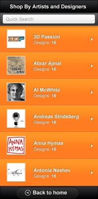
Trugbild’s added “search” box.
Which Devices to Target for Compatibility
Trugbild says that the mobile market leaders are iPhone and Android and that it’s a must to make the DecalGirl.com mobile site compatible with those devices. Trugbild asks Peters to use DecalGirl.com’s traffic demographics to aid in determining which mobile devices are most used to access Peters’ site.
Trugbild offers this caveat, however. He says that it’s important to also take into consideration that the visitor statistics that Peters’ will obtain is based on the desktop version of the website and that these statistics may change drastically due to the mobile optimization, likely attracting more mobile users. So, once the mobile site launches, it’s important to monitor the visitor statistics and keep up with their mobile devices, browsers and operating systems to maintain best compatibility.
Mobile optimization platform providers differ in which devices are supported. Trugbild’s MobilizeToday.com offers mobile platforms that are compatible with the following devices and operating systems.
- iOS: iPhone and iPod Touch
- Android OS devices
- BlackBerry OS 5 and up
- Palm webOS 1.4 and up (Pre and Pixi)
- Windows Phone 6.5 and up
- Symbian S60

Ryan Peters
Android and iPhone compatibility is the most affordable for MobilizeToday to offer, Trugbild says, because his company has done the most development and testing on those leading brands. If Peters wants to add other mobile devices to the compatibility list, it would increase costs due to the lack of development and testing that MobilizeToday has done with the devices that hold less share of the market, says Trugbild.
The user demographics for the DecalGirl.com desktop site show Peters that targeting iOS and Android devices is most ideal for his site. Combined, the iOS and Android users contribute to the largest percentage of traffic on Peters’ site: a total of 5.5 percent. Peters notes that although BlackBerry device users produce only .43 percent of the desktop site’s traffic, that is still several thousand visits per month and would like to see BlackBerry compatibility as well.
Trugbild agrees, and he and Peters decide to focus compatibility with DecalGirl.com’s user’s top three most used devices/operating systems: iOS (both iPhone and iPod Touch), Android OS and BlackBerry OS 6.
Further Adaptation and Omission for Mobile
As design of the inner-pages of the DecalGirl.com website continues, Trugbild outlines the various trouble-spots specific to the DecalGirl.com desktop site. These rich desktop site features will have to be adapted, if possible, or omitted entirely if adaptation is not possible for the mobile version.
Trugbild says that these particular features are troublesome because the JavaScript code used to create them on the desktop site causes longer load times on a mobile device:
- Live Help. The live customer support chat option that is available on the desktop version of DecalGirl.com is provided by an external, third party service and will be omitted in the mobile view.
- Product Imagery. The product listing pages are image heavy and Trugbild is concerned that loading that imagery on a mobile device would result in slow loading and an overall poor user experience. Unfortunately, the images cannot be discarded because it is a main selling point for the DecalGirl.com products. The images must be adapted for the mobile view and Trugbild suggests using various JavaScript coding techniques to reduce that load.
- Image Previews. Trugbild notes that as customers shop on the desktop version of the DecalGirl.com cart, the products and variables selected cause various “pop-up” boxes to appear with imagery or further product detail made possible with JavaScript code. But, this style is, again, to “load-heavy,” as Trugbild says. Trugbild plans to come up with a different solution to display those variables.
- Slideshows. The desktop version of the site features product slideshows using JavaScript and Trugbild recommends that this be omitted in the mobile view, due to load time.
- User Comments Form. Peters’ site has a JavaScript, code-based comments form for users to leave comments about products, and to rate them. Trugbild is concerned that this might pose a problem when customizing the site to mobile and recommends omitting it.
Summary
Once again, Peters expressed a clear goal for how he wants his mobile site to look and function: streamlined, with simple navigation for consumers. With that in mind, Trugbild delivered an initial mockup of the inner-pages. Peters wanted to see scrolling lists of inventory, rather than a paginated lists. Trugbild began altering the inner-pages to Peters’ specifications and added an additional search function, as well.
Peters discovered the primary mobile operating systems used by visitors to his site — and Trugbild focuses compatibility to — to be: iOS (iPhone and iPod Touch), Android OS devices, and BlackBerry OS 6 devices. Trugbild also outlined some desktop features that may not be possible to adapt and might have to be omitted as both parties prepare for the finalized mobile platform design.
In the next installment, we’ll follow the final design of the inner-pages of DecalGirl’s mobile menu and shopping cart modification for mobile use.


 Google Ads Gets 3 AI Max Updates
 Chrome Extensions for GenAI Visibility
 Vibe Code Your Own Ecommerce App
 New Ecommerce Tools: April 28, 2026
 Competitive Pricing Starts with Data
 New Ecommerce Tools: May 6, 2026
 SEO for AI, Low Traffic, No Clicks