
An ecommerce shopping cart page is most naturally a display of tabular data, listing the title and price for each item a shopper has selected. But HTML tables can be difficult to read on smartphones. Using a framework like Bootstrap can help improve the mobile shopping experience.
In the context of payment flow, the ecommerce shopping cart page is a summary of everything a shopper has chosen. It is the last stop before starting the checkout process. Shoppers frequently use the shopping cart page to review their selections or make changes.
Mobile-friendly Cart Page
On a desktop or laptop computer screen, a shopping cart page’s content often looks like a table. In the example image below, there are two products visible. Each is in its own row. Each row has five columns, showing an image of the product, the product title, the unit price (price each), the quantity selected, and the total price for the product.
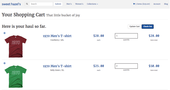
It is customary for an ecommerce shopping cart page to have a table-like layout with each item in a row.
This table-like layout looks good on relatively large screens. But it does not translate well on a smartphone.
A cart page layout should adapt to a much narrower screen size. In this example, below, there are screen simulations for an iPhone 6 and Nexus 5X. In both cases, the product information is displayed vertically, with the product image on top. The product title is next, and additional product information is beneath that.
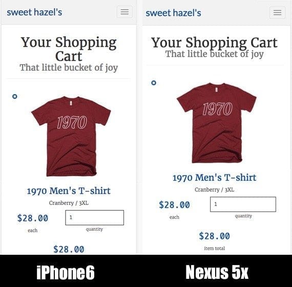
Tabular layouts may not work well on a relatively small mobile device, so it can make more sense to stack the information.
In the balance of this article, I will describe how I built a responsive, mobile-first checkout page for a Shopify store using the Bootstrap 3 framework. The goal is not to give you a recipe that you can follow step-by-step, but rather to introduce you to Bootstrap and how you might lay out a shopping cart page.
Basic Page Layout
The context for this article is a Shopify theme. There is a master layout file, theme.liquid, which brings in the page header, footer, CSS, and scripts. I am not going to cover the particulars, just know that Bootstrap is included and the header that appears in some of the screen captures comes from a separate file.
Shopify’s templating language is called Liquid, thus the liquid extension. I will use a bit of Liquid to help get product information, but my emphasis will be on the HTML, CSS, and Bootstrap-specific classes.
<div class="container-fluid">
  <div class="row">
    <div class="col-xs-12">
      <div class="page-header">
        <h1>Your Shopping Cart <small>That little bucket of joy</small></h1>
      </div>
    </div>
  </div><!-- end .row -->
</div><!-- end .container-fluid -->
This first section of HTML sets up the Bootstrap grid. Notice the first div element’s class, container-fluid. This class will make the layout full width.
<div class=”container-fluid”>
  …
</div>
The next div element establishes the Bootstrap grid row. Out of the box, each row has 12 columns.
<div class=”container-fluid”>
  <div class="row">
    …
  </div>
</div>
The third div element class is specifying the grid type, sm, and the number of columns. Bootstrap has an extra small (xs), small (sm), medium (md), and large (lg) grid option. The example class, col-xs-12, causes the enclosed content to take up all 12 of the available columns on the grid sizes.
<div class=”container-fluid”>
  <div class="row">
    <div class="col-xs-12">
      …
    </div>
  </div>
</div>
The content in this first row is a page header.
<div class="page-header">
  <h1>Your Shopping Cart <small>That little bucket of joy</small></h1>
</div>
By default, Bootstrap will display the small text inline and align the entire page header to the left. For a smartphone, I would rather have the page header centered and the small text appear on its own line. So I add two CSS directives to my own stylesheet to override Bootstrap.
.page-header {
  text-align: center;
}
.page-header small {
  display: block;
}
Bootstrap is mobile first. I therefore place style directives for mobile devices in the main section of the CSS and put changes for larger screens in a media query. While I do prefer the centered layout on mobile, I like Bootstrap’s defaults better for laptops and desktops. So I add the styles below to undo my changes on screens 768 pixels wide or wider.
/* Small devices (tablets, 768px and up) */
@media (min-width: 768px) {
  .page-header {
    text-align: left;
  }
  .page-header small {
    display: inline;
  }
}
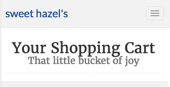
The shopping cart page displays the content header. The custom CSS declarations center the text and put the small subtitle on its own line.
The Shopping Cart Form
Next, I create a new row and set up a 12-column wide div element. This will be the parent element, which will hold the shopping cart content.
<div class="row">
  <div class="col-xs-12">
    …
  </div>
</div>
When a shopper visits the cart page, I want to give him the opportunity to update his selections. There are a few ways I could have achieved this, but here I used a simple HTML form that will call the Shopify server when a change is made. This form should be nested inside of the row and 12-column element I just wrote.
<div class="row">
  <div class="col-xs-12">
    <form action="/cart" method="post" novalidate>
      ...
    </form>
  </div>
</div>
Nested Rows and the Cart Product Information
Just inside of the form element, I insert a Shopify Liquid iteration tag. This Liquid tag will access the cart object and loop over each product in the cart. Any code placed inside of the open and closing Liquid tags will be repeated once for each product in the cart. The current product in the loop will be referred to as item.
{% for item in cart.items %}
{% endfor %}
Bootstrap allows us to nest rows and columns within rows and columns. Nesting makes it possible to subdivide a page. I’ve created a 12-column wide div element. I put a form inside of it, and now I am going to subdivide that space to lay out the product information.
{% for item in cart.items %}
<div class="row cart-row">
<div class="col-xs-12 col-sm-2">
<div class="pull-left">
<a href="/cart/change?line={{ forloop.index }}&quantity=0">
<span
class="glyphicon glyphicon-remove-sign"
aria-hidden="true"
></span>
</a>
</div>
<a href="{{ item.url | within: collections.all }}">
<img
src="{{ item | img_url: 'medium' }}"
alt="{{ item.title | escape }}"
class="img-responsive"
>
</a>
</div>
</div><!-- end .row.cart-row -->
{% endfor %}
There are a few things to note in this code block.
First, notice that the row div has an additional class, cart-row. This is a class I created to add some custom styles and overrides.
<div class="row cart-row">
Second, there are two column classes in the next div element. Here, I am telling the browser (via Bootstrap classes) to make the enclosed content fill up all 12 columns when the screen is less than 768 pixels wide. But when the screen is 768 pixels wide or wider (sm grid), I want the enclosed content to just take up two of the 12 available columns.
<div class="col-xs-12 col-sm-2">
Inside of this div element, I have a small link, which is meant to remove the current item from the shopping cart and the product image. Liquid does the heavy lifting here. Do, however, notice that the image has a class of img-responsive. This is a Bootstrap class that will modify the size of the image so that it does not overflow its parent element.
To this code, I add three custom CSS declarations in my stylesheet. The first of these adjusts the row’s margin and padding, effectively overriding Bootstrap’s defaults. The third style description will center the responsive image in its parent element when that parent element is wider than the full-sized image.
.cart-row {
  margin: 10px 0;
  padding: 10px 0;
  border-bottom: 1px solid #e1e1e1;
}
.cart-row div {
  text-align: center;
}
.cart-row img.img-responsive {
  margin: 0 auto;
}
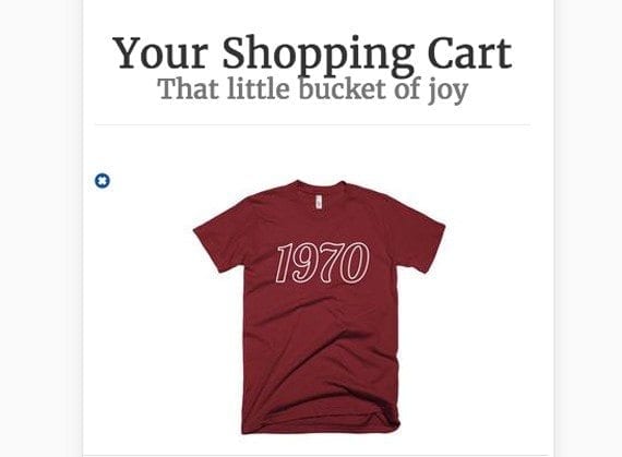
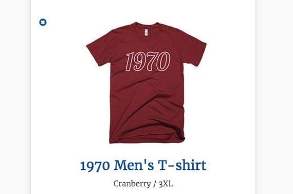
If we stopped to look at our shopping cart page so far, we would find a relatively large product image displayed for each item in the cart.
In the mobile layout the product image is displayed at the top of each “row” of product information.
The next section of markup will add the product name, color, and size. The div element, again, has two column specifications. On a screen narrower than 768 pixels, the title will take up the full width (all 12 of the available grid columns), but on a larger screen it will fill just four of the available grid columns.
<div class="col-xs-12 col-sm-4">
  <h3><a href="{{ item.url }}">{{ item.product.title }}</a></h3>
  {% unless item.variant.title contains 'Default' %}
    {{ item.variant.title }}
  {% endunless %}
</div>
The bit of Liquid markup adds the product URL, title, and variant title, which, in this example, is the size and color information.
For each item in the shopping cart, the product name and the color and size combination is displayed below the product image.
From here I am simply adding blocks. Each block in the grid contains some information about a product in the cart.
The next block, if you will, shows the unit price for the product in the cart. Notice that it takes up five of the available columns on the smallest of screens and two columns on larger screens. Liquid gets the price (which is stored in pennies) and converts it to dollars, including the dollar sign and the decimal point.
<div class="col-xs-5 col-sm-2">
  <h3 class="h3-price">
    {{ item.price | money }}
  </h3>
  <small>each</small>
</div>
I want the price to display in a special font. So I use the custom h3-price class. Here are the style declarations it references.
.h3-price {
  color: rgb(20, 80, 150);
  font-family: 'Oxygen Mono', monospace;
}
Oxygen Mono is a free font available on Google Fonts.
As an aside, Shopify allows me to use Sass, which is a preprocessor for CSS. Thus I am able to use variables to represent things like the font color and family. As a result, my actual SCSS (the Saas syntax), looked like the following, and what you see would be the result after the CSS was processed.
@import 'https://fonts.googleapis.com/css?family=Oxygen+Mono';
$sweet-blue-primary: rgb(20, 80, 150);
$sweet-monospaced: 'Oxygen Mono', monospace;
.h3-price {
  color: $sweet-blue-primary;
  font-family: $sweet-monospaced;
}
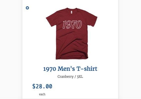
Since the price block takes up just five of the available grid columns, it is aligned to the left below the product name and image.
The next section adds information about the quantity selected for a particular product in the cart. This block follows the same pattern as earlier blocks, although it does employ a form input element.
<div class="col-xs-7 col-sm-2">
  <div class="form-group">
    <input
      type="number"
      name="updates[]"
      id="updates_{{ item.id }}"
      value="{{ item.quantity }}"
      min="0"
     class="cart-qty-input"
    >
    <small>quantity</small>
  </div>
</div>
The div wrapping this block takes up seven of the available 12 grid columns on extra small screens. When combined with the unit price div, which takes up five grid columns, all 12 columns will be filled. On larger screens the quantity input takes up two grid columns.
Note that the form-group class is built into Bootstrap and will provide the basic styles for the input. The cart-qty-input is my custom class. It overrides some of the default Bootstrap styles and adds a few of my own. Notice the font family variable is another example of Sass CSS and requires the Sass preprocessor.
.cart-qty-input {
  font-size: 1em;
  font-family: $sweet-monospaced;
  margin-top: 10px;
  padding: 10px;
  width: 95%;
  border: 1px solid black;
}
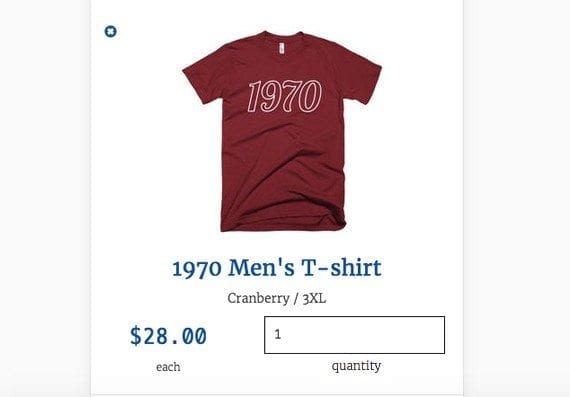
The number of units selected or quantity lays out to the right of the price on the same line.
If we keep with the block analogy, the final block will show the total for a given product. There is nothing new here.
<div class="col-xs-12 col-sm-2">
  <h3 class="h3-price">
    {{ item.line_price | money }}
  </h3>
  <small>item total</small>
</div>
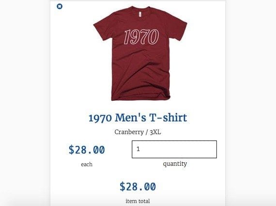
The total price for this item in the cart is shown at the bottom. In this example, since the quantity is one, the unit price and total price are the same. If the quantity had been greater, the total price would have been greater.
Summing Up
With just a bit of HTML and CSS and some help from Bootstrap, I was able to create a good looking cart page that displays product information vertically on small mobile screens, but like a table on relatively larger screens.
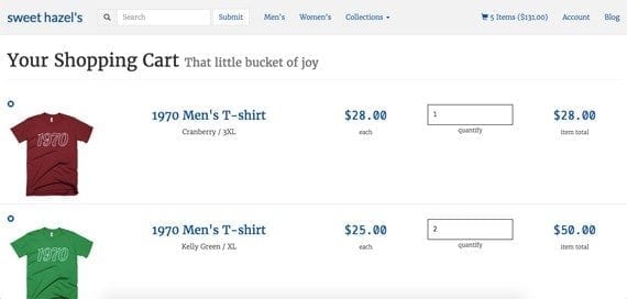
On larger screens, Bootstrap’s grid lays out the products in the cart like a table.


 Hostinger Reframes Site-Free Ecommerce
 AI Visibility Scores Are Useless
 A Subtle Google Ads Bidding Change
 New Ecommerce Tools: July 7, 2026
 New GA4 Channel Tracks AI Traffic
 RCS or SMS? It Depends on the Task