Online retailers must design sites that work well and look great on tablets as those devices emerge as a favorite for online shoppers. Designing for tablets include adaptive layouts, touch-sensitive navigation, great images and graphics, and fast load times.
Some 25 percent of American’s now own and use a tablet computer like Apple iPad, Google Nexus 10, Samsung Galaxy Note, Amazon Kindle, and Microsoft Surface, according to an August 2012 report from the Pew Internet & American Life Project. Tablet adaption is outpacing smartphones’ growth rate from a few years ago, and there are many reports indicating that online shoppers like using tablets to make purchases or browse for future purchases.
Conscientious online retailers will want to redesign their stores to accommodate tablet shoppers. There are at least five things that merchants can do to make an ecommerce site look and work better on tablets.
Adapt to the Device
Years ago, website designers and developers would build several versions of a site, in fact, there was even a time when it was a good idea to build separate sites for Microsoft’s Internet Explorer and its primary competitor at the time, Netscape Navigator.
More recently, designers built completely separate versions of a site for mobile devices. These mobile sites frequently offered only some of the content available on the full version of the site.
This multisite trend was very frustrating for users who were familiar with the layout and features of a company’s “full site,” but who could not access those features or find what they wanted on the mobile (.mobi) version. Users wanted one web, if you will, for all devices.
Thus, a better approach for presenting a good looking site to tablet — or other mobile — users is to build a one that responds to the size of the client device or window and adapts some of the content to provide a mobile browsing experience.
In responsive design, the developer or designer uses flexible layouts — frequently flexible grids — in conjunction with CSS features like media queries to build pages that respond to the user’s environment, including screen orientation, and interaction or behavior.
In a well-planned responsive or adaptive design, there is continuity between the layouts, where smaller, faster-loading versions of some content may be used in the mobile environment. Or some content can be held back and then added via Ajax when a user requests it, but the site, whether displayed on an iPad or a desktop is still the same, with the same features, and a similar layout.
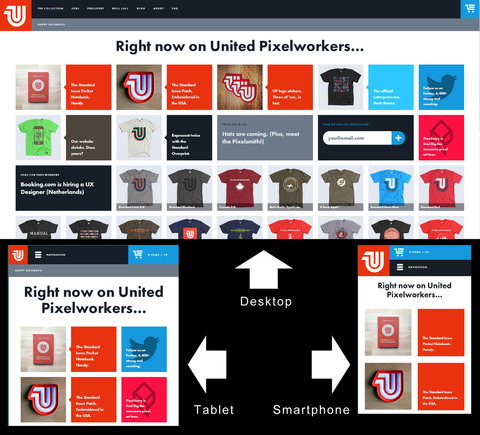
An excellent example can be seen in the United Pixelworkers website. This retail site is changes its size as it is viewed in different devices, but it uses consistent layout style, graphics, and features.
The United Pixelworkers site renders well on all devices.
Provide Finger-friendly Navigation
Navigation is an important part of designing sites that look beautiful on tablets. In fact, making a site easy to navigate on a tablet’s touchscreen might be the single most important thing that an online retailer can do to improve how a site looks and acts.
First, ensure that navigation is not dependent on hovering. Hovering is an awesome effect on laptops and desktops, but it doesn’t presently exist on tablets.
Next, consider consolidating the navigation under a single tab or button. Here again, the excellent United Pixelworker’s website serves as a good example. The site also uses what is becoming the standard icon for consolidated navigation — three horizontal lines.
The United Pixelworker’s site navigation is shown under a single icon on the tablet version of the site.
Finally, content sliders that are used for navigating to features should be swipe-enabled. Tablet users want to navigate with their fingers. Make that easy for them.
Use Lightweight and Beautiful Images
Designs built to display well on tablets should not be designs devoid of images and graphics. In fact, the opposite might be true.
Tablets are by nature tactile devices. Users want to “touch” the products when they shop from a tablet. What’s more, tablet devices, like the iPad, are designed to render photographs and images wonderfully.
To build a great looking site on any device, use great looking photography and graphics. But, you may want to adapt that photography for the device. This can be done with scripts that load smaller, lighter in terms of file size, images when the shopper is using a smaller device, like a tablet. Don’t shy away from photography, but find ways to load it quickly.
Replace Graphics with CSS as Appropriate
Having just pointed out that sites built for tablets should fearlessly use images and graphics, it is worth noting that not everything needs to be a graphic.
In the past, web designers might use an image for backgrounds, gradients, icons, or logos. While this is still perfectly acceptable, it is not possible to do many, if not most, of these kinds of graphics using CSS. These CSS-based graphics should load much, much more quickly than images, meaning that a store’s site will pop into view more quickly. Now that is beautiful.
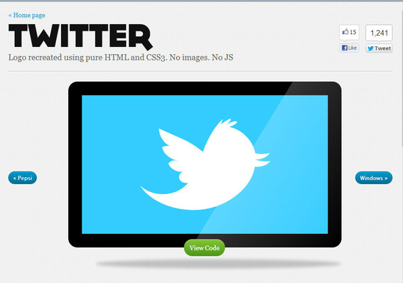
As an example, Ecsspert has demonstrated how to produce several well-known logos with CSS alone.
Ecsspert recreated the Twitter logo using CSS descriptions.
Optimize for Faster Load Times
How quickly a page loads on a tablet device can have an impact on how well users like a site. In some sense, one part of what makes a site good for tablets is how fast that page is visible and usable.
When designing a site for tablets, optimize it. This means consolidating images into sprites — a collection of images that can be displayed separately but loaded once — concatenate or combine style sheets and scripts to reduce the total number of HTTP calls that the site must make.


