
Editor’s Note: In September 2010 we published “Volunteer for a Free Mobile-Optimized Ecommerce Site,” soliciting merchants to volunteer for a mobile optimization case study in which we follow the process of creating a mobile site step-by-step. Dozens of merchants submitted their sites, and after a review process, we narrowed our selection to DecalGirl.com. The fourth and final installment of the case study follows, below.
The first installment, “Optimizing an Ecommerce Site for Mobile Devices, Part 1: Getting Started,” we published in November, as MobilizeToday.com, a mobile development firm, and DecalGirl.com, an ecommerce company that sells “skins” for mobile devices, began exploring strategies on how to best approach this project.
We published the second installment, “Part 2: Layout and Design,” in December following the initial mockup of the mobile home page development for DecalGirl.com.
The third installment, “Part 3: Design and Compatibility,” came in late December. It followed the challenges of device compatibility and adaptation of a website originally built without mobile in mind.
Now, in this final “Part 4” installment, we review the implementation and launch of the mobile site.
Interior Page Design
In “Part 3,” Trugbild and Peters both designed home pages for the mobile site. Both parties preferred Peters’ own design. Once the home page was decided, the style and the number of interior pages had to be nailed down.
Trugbild put together mockups of 14 interior pages, using a grey-black background for the checkout and individual product purchase pages, with a vibrant-orange background for the backgrounds of the browsing-oriented pages.
Orange product pages.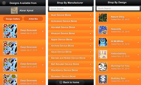
Peters felt the design was good but decided he wanted to drop the orange background altogether, with the idea that the orange distracted too much from the actual product thumbnails. Trugbild then produced all grey-black backgrounds for all the pages.
Grey-black interior pages.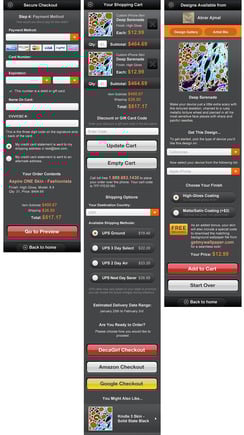
The mobile site had all the visual elements completed. Then it was up to Trugbild to code the layout and design of all the pages. Peters’ job was to get the server-side functionality working and coded.
Grey-black product-pages.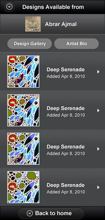
Coding Proved Difficult
The coding process by Peters wound up taking much more time than he expected. Trugbild delivered the final page graphics on Feb. 7 and delivered the markup files — all the CSS, the imagery, HTML, and JavaScript language — for the mobile site to function properly on Feb. 17. Peters was then off and running.
Once again Peters’ vast knowledge of coding and website development came in handy. Early on in the process, MobilizeToday discovered that Peters, the co-founder and CEO of DecalGirl.com, is in a unique position with regards to mobile optimization of this site: He is the original developer of the entire website, including the custom shopping cart.
While preparing the markup and mobile site elements for launch, Peters hit relatively few and minor bumps along the way. The mobile customer credit card information page did not have a billing address form and that was added easily. Peters wanted a quick search functionality added to the product pages so as users type, the lists begin to filter down based on each letter typed in. Trugbild put together the markup for this functionality in about 1 day.
Trugbild also suggested that Peters add what is called “Infinite Scroll,” allowing users to scroll downward through a list that is larger than the viewable space on the page until they reach the bottom of all the items in a list, rather than having to click a “Next” or “Back” button to move through a collection of pages. Peters agreed and added that functionality to the site.
Mobile Site Launch
But the challenge proved to be great on Peters, getting the mobile site operational — developing and testing code from Feb. 17 onward. And as of the date of this article, Peters had just moved the development of the mobile site to a publicly-available mobile address — m.decalgirl.com — on March 31 with limited functionality.
DecalGirl.com mobile home page, top half on left.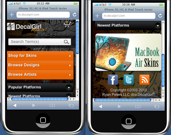
For the launch of the mobile site Peters got basic browsing and shopping functionality working. He was able to get the filtering function to work on the “Manufacturer” and “Device” lists only. Peters was able to get customer checkout prepped but not finished. The last step of credit card processing and customer receipt creation and sending was not ready by launch.
Peters had to choose what to focus his time on. So he chose to spend it on the front-end, the myriad of product options that needs to be written and tested.
More Time and Testing Is Needed
The much longer time-to-implement and launch was described by Peters. He says, “A lot of the front-end code had to be rewritten in its entirety. I’m discovering that one of the issues with a complex site like this one — and just basing function off of static mockups — is that it doesn’t take into account all the differences between different products.”
Peters’ mobile device skins have multiple options upon purchase — from color to size to additional finishing touches like a high-gloss or matte coating. All of those variable options adjust the pricing and what information is displayed on the cart during checkout. Peters says, “There’s around 100 different product specific options to lay out, test and write code for.”
As Peters started building these pages, he noticed that the navigation seemed clunky — another variable that could not be discovered in a static mockup.
After getting the mobile site up and operational, albeit with limited functionality, Peters had this to say, “As I’ve dug into it, I’m basically rewriting the entire site — scripting, formatting of data, AJAX components and more — to support this. It’s a very involved process, especially due to the complexity of our product lines. It’s much more work than I’d anticipated and even allocating so much of my own time as I can to it, it’s taking a while.”
Over the coming weeks and months, Peters hopes to get his mobile site fully operational.


 Google Ads Gets 3 AI Max Updates
 Chrome Extensions for GenAI Visibility
 Vibe Code Your Own Ecommerce App
 New Ecommerce Tools: April 28, 2026
 Competitive Pricing Starts with Data
 New Ecommerce Tools: May 6, 2026
 SEO for AI, Low Traffic, No Clicks